Kids These Days [Infographic]

Get off my lawn with your iPads, ya hooligans! If you know kids these days, you’ll know that they just love technology, let me tell you what! In fact, there are so many different tools to utilize, it’s hard to even know what kinds to invest in. Cell phone, iphone, ipad, nexus, android, mac, pc, etc. It’s a bit boggling.

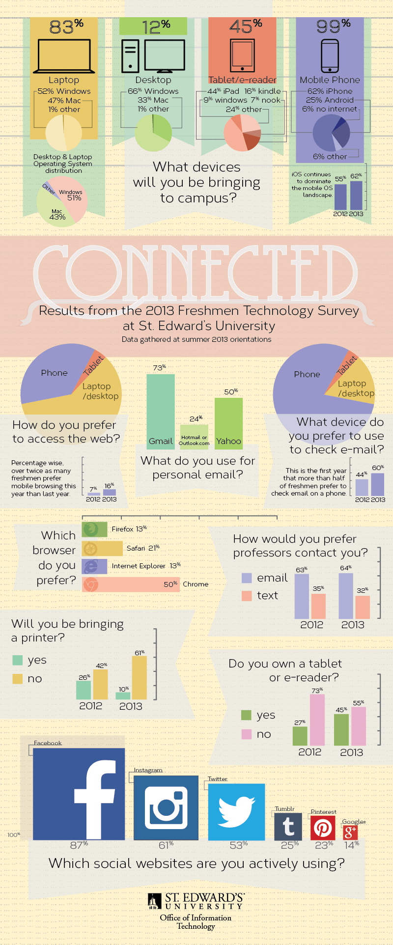
This infographic, done by a local college, investigates what percentages of Freshman students are bringing in what. Granted, this is a smaller, private college, so the results may be skewed from your own, but nevertheless illuminates what technologies are being utilized the most in preparation for BECOMING AN ADULT BY GOING TO COLLEGE (echo). In all seriousness though, technologies really are shaping the modern job market and what is possible in global communication, as well as education.

The top-most percentages correspond with the overall campus population. The smallest number of these happens to be desktop computers. This isn’t surprising due to the popular use of laptops for portability and for taking notes in class; but more and more I’ve found that tablets are becoming very popular for this particular task. It’d be awesome to know what percentage would prefer taking notes on tablets as opposed to laptops…

All in all it’s a great age to live in where media, art, and knowledge can be so easily communicated across our planet. The future of education really does lie in the digital realm.

[via]


© Eric Lyday for Daily Infographic, 2013. |
Permalink |
No comment |

Post tags: android, browser, cell phone, chrome, college, Computer, desktop, e-reader, email, facebook, firefox, Freshman, gmail, google, hotmail, Instagram, internet explorer, iPad, iphone, macbook, microsoft, mobile, OS, own, pintrest, printer, safari, St. Edwards University, students, tablet, technology, text, tumblr, twitter, Windows, yahoo

Stop Running From Your Home Energy Bill [Infographic]

If there’s one thing I’ve learned from living in Texas during the summer, it’s that energy bills can be a major pain. Just from past experience it makes sense why our state has one of the five highest electricity bills in the nation. What I didn’t know, however, is that things weren’t always this bad. In the last three years energy bills have risen by an astounding 37%. This can be attributed to the increased use of household appliances and electronic devices (not just the weather). Also, surprisingly, newer houses (year 2000 and later) typically use 2% more energy. So can anything be done to lower these costs? The simple answer is yes, but it may take some habit breaking and some smart use of technology.

In my house, I’m constantly having to turn off lights, appliances, stereos, etc. that my roommates leave on forever. The reason I do this is because through actively regulating how much energy you’re using actually can make a difference in your utility bill. This in combination with lowering the thermostat during winter and turning off the air during summer (when you don’t need it AKA when you’re out of the house) will also be a life-saver for your energy use. Now with smart technologies such as Nest and ADT, you can sync your house thermostat, appliance use and lighting options with your phones, tablets, or computers to change your electricity usage even when you aren’t at home! I’m curious to see how technologies such as these will impact the nation’s average energy bill in the future. We shall see.

[via]
ADTPulse-Infographic-mod2


© Eric Lyday for Daily Infographic, 2014. |
Permalink |
One comment |

Post tags: ADT Pulse, air conditioning, appliances, Computer, costs, electronic devices, energy bill, household appliances, lower, phone, smart technology, tablet, texas, Thermostat

How Many Lines of Code Does it Take? [Infographic]

They say that coding is a language of sorts. A series of text files that ultimately are turned into 1′s and 0′s that make up a localized universe of whatever the coder intends. In this way I like to think about the programs and operating systems that we use everyday as books of sorts, and coders as the authors of these books. I know the book analogy is kind of pushing a bit far from the source, but for me it’s a way to mentally picture how much typing, thought, and information goes into the operating systems of the technology of today.

I’m not a coder myself (so please correct me if I butcher this) but basically a line of code constitutes some sort of variable to be analyzed by a computer calculator. There can also be lines of logistical preferences – action words that give input as to what to do with these variables. Also there can be lines in which to comment on these previous iterations of code – this serves to help the coder remember what the heck all of these lines of code mean. Although I’m not sure if the statistics of this infographic pertain to comment code (most likely not), it is quite astounding just how many lines of code it takes to make some of these technological operations work. Facebook for instance has at least 15 times more code in it than a Large Haydron Collider does (pre debugging). I don’t know about you, but that is kind of frightening and amazing at the same time.

[via]


© Eric Lyday for Daily Infographic, 2013. |
Permalink |
22 comments |

Post tags: code, computers, facebook, large haydron collider, lines, operating systems, technology

The Biggest Waves Ever Surfed [Infographic]

I’ve always wanted to learn how to surf. It looks so peaceful and zen, despite the fact that it is basically an art of controlled falling. I’ve gotten into some of the more modern ‘extreme’ boarding like snowboarding and skateboarding, but I feel like surfing is really the seed of these now so-called ‘extreme sports’.

It’s believed that the ancient Polynesians (progenitors of Hawaii) started the act of surfing. The first written record was by Joseph Banks aboard the HMS endeavor in 1779, although the cultural custom of surfing most likely predates this record. The ancient Hawaiians regarded surfing, or he’e nalu (wave sliding), as an almost sacred activity to communicate with the ocean and pray for their protection and strength. I bet every single one of the surfers on this infographic were praying as well. Most likely praying for their life not to end after riding these giant tsunami-waves.

As you can see, this infographic uses the friggin’ Statue of Liberty as a scale for how massive these waves are. EFF THAT’S HUGE. You can even see all of the puny air we’ve gotten through other methods – snowboarding, skating, jumping, etc. Nothing can quite get you higher than that thing that takes up about 70% of earth.

THE OCEAN

[via]


© Eric Lyday for Daily Infographic, 2013. |
Permalink |

Post tags: air, biggest, board, ever, extreme, Hawaii, Hawaiians, largest, massive, Polynesia, Polynesians, skateboarding, snowboarding, sports, Statue of Liberty, surfed, surfing, the ocean, tsunami, waves

When Sea Levels Attack! [Infographic]

This infographic actually reminds me of when I was a kid watching one of my favorite movies – Water World. Freaking aqua-man Kevin Costner vs. Eye-patch Dennis Hopper. I mean, it’s really a bad movie, but it’s the concept that was so interesting to me. Of course, it was fantasy back then, but now I feel like Water World is even more convincing to me now than when I was an impressionable child who thought that Flubber was totally real.

Haters gonna hate, but climate change is happening whether you like it (believe it) or not. The world is already 71% water–it doesn’t seem too outrageous to believe that melting ice might up the anty on that number majorly. Please, just watch Chasing Ice, it more than clearly shows the astonishing amount of ice that has been (and will be) falling into the sea everyday.

I’m quite sad that climate change has become such a political issue. So many scientists have proven time and time again that what we are doing on this planet affects the planet itself. It just astounds me that we haven’t been doing more to curb our carbon emissions. Well, I guess we can just live in Water World. That’d actually be pretty sweet. Nevermind. Carry on. I’ll pay you one million pounds of dirt to say you never read this infographic. (I want to be Kevin Costner)

[via]


© Eric Lyday for Daily Infographic, 2013. |
Permalink |
One comment |

Post tags: calving, Chasing Ice, climate change, earth, global warming, ice, levels, ocean, planet, Polar, salt water, sea, sheets, water, Water World