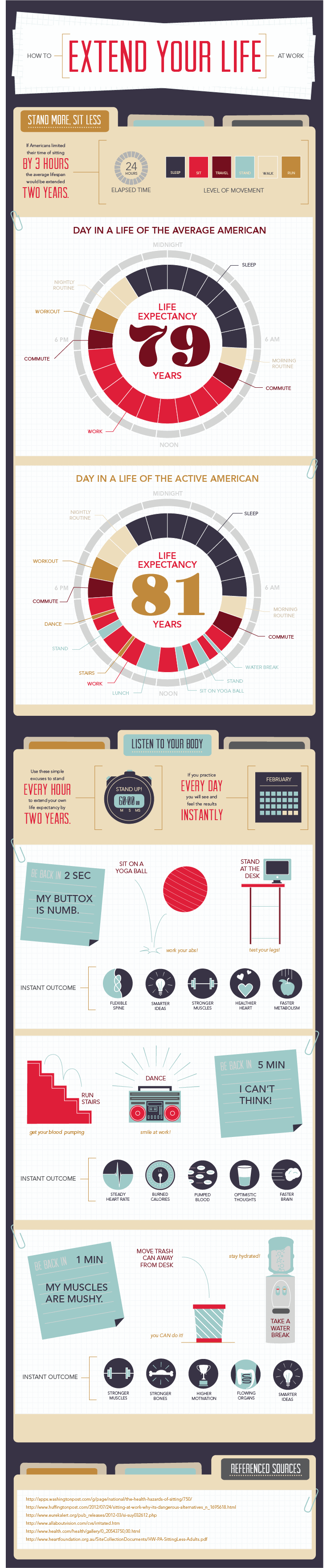
How To Extend Your Life At Work [Infographic]

I hate talking about work just as much as the next person, I would much rather talk about the football game- or just drink a beer and talk about nothing. However, considering the average American spends 90,000 hours at work over the course of their lifetime deserves a conversation.

There have been many infographics posted about how work (or working too much) can contribute to an early death. With this information, the answer seems simple- don’t go to work! Well, if you have bills, rent, and car payments hanging over your head this is simply not possible. So all the average person can do is figure out why bad habits to avoid at work that are the #1 contributors to an early death.

According to this infographic, the more an individual sits down during their waking hours the shorter their life expectancy is. While the actual numbers may be a little more fuzzy- sitting down (no matter how good it feels) is not terribly healthy. Try and find excuses to stand up and mover around at work. This can be hard sometimes- but it can mean moving a trashcan further from a desk, or simply standing at your desk.

Work is a touchy issue for most. With all the recent findings on how unhealthy the average work environment is- combined with the fact that unless you’re born into a large trust fund you have to work 40+ hours to survive, it can often feel like a no-win situation. However, this infographic has some helpful tips to make it not quite so dire- enjoy. [Via]

HowtoExtendYourLifeatWork (1)


© Erich Scholl for Daily Infographic, 2014. |
Permalink |
No comment |

Post tags: business, death, Employment, habits, health, Healthy, life, time management, work, workplace

Kits of the Future [infographic]

Football, sometimes known as soccer, is one of the worlds’ most coveted games. Millions of dollars are invested in the game and people spend tons on tickets and merchandise. With such popularity, the game needs to adapt to changing times, but how can the sport be made to better serve the viewers as well as allow the referees to make better calls? We only need to look to the future!

Live player stats can be monitored throughout the game. Items that will be cataloged is a multitude of information like the amount ran, accuracy, and time on the field. This could easily settle the arguments about which player is the best.

We all know that some players have huge egos that can lead to dishonest behavior such as pretending to be hit hard. Impact visualizers will provide different colors in the event of a strong hit or a soft hit made by player against another. Impact visualizers could potentially put an end to babies rolling around on the field trying to get the opposing player another electronically displayed yellow card on their shoulder.

For even better visuals, jerseys can be illuminated  as well as carry live ads that will grant the spectators to register more precise movements made by players and draw in more money. Just how might these kits (uniforms) be powered, you ask? The kits will be powered by the kinetic energy of a player that will be converted to an electrical current. Yeah, the future.

Soccer (football), just as life, is ever changing. Stay tuned. Keep loving the game and enjoy what the future has to offer! [via]

kits-of-the-future


© J.P. Blackard for Daily Infographic, 2014. |
Permalink |
No comment |

Post tags: ads, best, egos, football, Future, game, illuminate, impact, jersey, player stats, powered by kinetic energy, soccer, viewers, visualizers, yellow card

Creative Routines [infographic]

Alright, it’s time to stop whatever it is you were doing to look at what old white bearded dudes with fancy hair do with their day. At least the creator of this infographic included Maya Angelou, although it does come off as lukewarm attempt to give it some much needed balance. Regardless, the people that are mentioned certainly aren’t irrelevant chumps and there’s some pretty interesting information here.

Sure, you can draw a few parallels person to person, but there aren’t really any glaringly profound patterns that reveal the secret to creative output. Even though everyone here is an early riser, consider someone like Hunter S. Thompson. If he was on here it would show something along the lines of waking at 3 pm to alternate between cocaine and cigarettes until a marathon of writing from midnight to 6 am. That’s a very stark contrast to what you see here yet Hunter was still a fiercely prolific and successful writer. What this infographic is really promoting is that productivity is boosted just by having a routine, whatever it may be. I’m sure though that the benefits of having structure to your day to day life isn’t really news to anyone.

Sometimes it seems like histories greatest minds were superheroes. This is a great reminder that they were in fact human just like the rest of us. They perfected their craft by devoting their time to it, which is something we are all capable of.

[Via]

daily-rituals


© Dylan Cope for Daily Infographic, 2014. |
Permalink |
No comment |

Post tags: Benjamin Franklin, charles darwin, charles dickens, creative, gustave flaubert, honoré de balzac, hunter s. thompson, immanuel kant, john milton, le corbusier, ludwig van beethoven, maya angelou, productivity, pyotr ilyich tchaikovsky, ritual, routine, sigmund freud, thomas mann, victor hugo, w.h. auden, wolfgang amadeus mozart, writing

Stop Running From Your Home Energy Bill [Infographic]

If there’s one thing I’ve learned from living in Texas during the summer, it’s that energy bills can be a major pain. Just from past experience it makes sense why our state has one of the five highest electricity bills in the nation. What I didn’t know, however, is that things weren’t always this bad. In the last three years energy bills have risen by an astounding 37%. This can be attributed to the increased use of household appliances and electronic devices (not just the weather). Also, surprisingly, newer houses (year 2000 and later) typically use 2% more energy. So can anything be done to lower these costs? The simple answer is yes, but it may take some habit breaking and some smart use of technology.

In my house, I’m constantly having to turn off lights, appliances, stereos, etc. that my roommates leave on forever. The reason I do this is because through actively regulating how much energy you’re using actually can make a difference in your utility bill. This in combination with lowering the thermostat during winter and turning off the air during summer (when you don’t need it AKA when you’re out of the house) will also be a life-saver for your energy use. Now with smart technologies such as Nest and ADT, you can sync your house thermostat, appliance use and lighting options with your phones, tablets, or computers to change your electricity usage even when you aren’t at home! I’m curious to see how technologies such as these will impact the nation’s average energy bill in the future. We shall see.

[via]
ADTPulse-Infographic-mod2


© Eric Lyday for Daily Infographic, 2014. |
Permalink |
One comment |

Post tags: ADT Pulse, air conditioning, appliances, Computer, costs, electronic devices, energy bill, household appliances, lower, phone, smart technology, tablet, texas, Thermostat

Travel is a Pain [infographic]

Traveling is a pain, and it causes pain too! I have never experienced any travel pain, but I have experienced the pain of traveling. Okay, I’m done with one-liners.

I’m sure anyone reading this has experienced a flight delay. Those are not fun. I Recently had a connecting flight in El Paso, Texas from Phoenix, Arizona. When I arrived to el Paso I saw that my flight was delayed 3 hours–I was livid! There were about 50 people arriving in the lively city of El Paso and they all came to the same horrible realization. I could tell that things were about to get ugly. Luckily since so many people were being delayed, they extended happy hour at the bar for the next 3 hours, half-priced drinks! We were quite a social group we all got to know each others lives over a few drinks. Turns out the band that plays with the singer Kimbra was delayed with the same flight and they had their instruments and played a little singalong that was amazing.

All of a sudden, about 2 hours into the delay, we began hearing our names over the intercom. Each person who was delayed received a free plane ticket to any destination in the continental United States! After we were feeling airport tipsy we all headed to our gate where all the seats were already taken, so we sat on the floor and started a massage circle! It was the greatest way to treat the pain of traveling. [via]


© Lena Long for Daily Infographic, 2014. |
Permalink |
No comment |

Post tags: cars, Delay, Kimbra, massage, pain, planes, S, travel, vacation

The Magnificent Multitude Of Beer [infographic]

If you’re anything like me then your first experiences with beer was probably an American lager. To be more specific you were probably trying to force down some warm Keystone next to your classmate’s pool while their parents were out of town. If you’re anything like me then you probably see your high school self as some absurd caricature of embarrassment. Maybe American brewing will never be taken seriously. At least it’s appropriate in the sense that it’s hard to take yourself seriously when you can’t recall any memory where a case of light beer was present.

Some people find that an ice cold Natty still gets the job done while others have become full fledged beer snobs. Either way there’s something to learn for even the most knowledgable beer drinker from this infographic. Be sure to take this information and use it wisely however. Nobody likes the guy who won’t shut up about his imperial stout, but nobody likes that dude who’s running around the party wearing the empty cardboard that once housed twentyfour blue and silver cans on his head either. There’s a time to kick back and indulge in a microbrew and there’s time when you need utility in a can because you’ve just got to rage. All things in moderation.

[Via]

Click the image for a larger version.

Qs8hHvh


© Dylan Cope for Daily Infographic, 2014. |
Permalink |
No comment |

Post tags: alcohol, ale, american lager, beer, brew, drink, imperial stout, india pale ale, IPA, keystone, Lager, microbrew, natty, Pilsner, porter, Stout

Which Major City is Best to Live In? [infographic]

Well, I finally got a big girl job and am making a big move from the Rio Grande Valley (southern Texas), all the way to north Austin. I’ve always loved Austin, but I’m not too familiar with it. So naturally, I’ve been researching EVERYTHING about Austin. Places to eat, fun things to do, different parks, etc. During my search, I came upon this interesting infographic, “Which Major City is Best to Live In?” Luckily, Austin made that cut. According to today’s infographic, Austin is the 12th best place to live, and is considered the city of live music. Other great cities made the cut too, such as: San Diego, Scottsdale, and Raleigh.  Ready for a change and looking to move? Check out today’s infographic to see what these fabulous cities have to offer! [via]


© Jasmin for Daily Infographic, 2013. |
Permalink |
No comment |

Post tags: austin, best, Cities, diversity, Fun, life, Moving, music, Nightlife, population, Raleigh, San Diego, Scottsdale

1 2 3 4