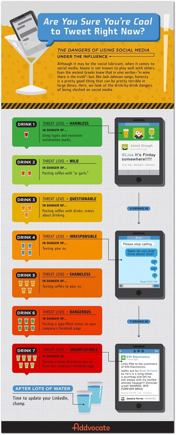
Would You Live in a Haunted House? [Infographic]

Many holidays that we celebrate have one or two traditions that truly define them, but they also have many other smaller traditions. Halloween is no exception to the rule: while dressing in costumes and trick-or-treating are the most defining Halloween traditions, we also have things like pumpkin carving, hay rides and haunted houses that are associated with the holiday. Haunted houses can be a lot of fun to visit around Halloween, with all of the decorations and people putting on a scary show, but the question is: would you actually live in one?

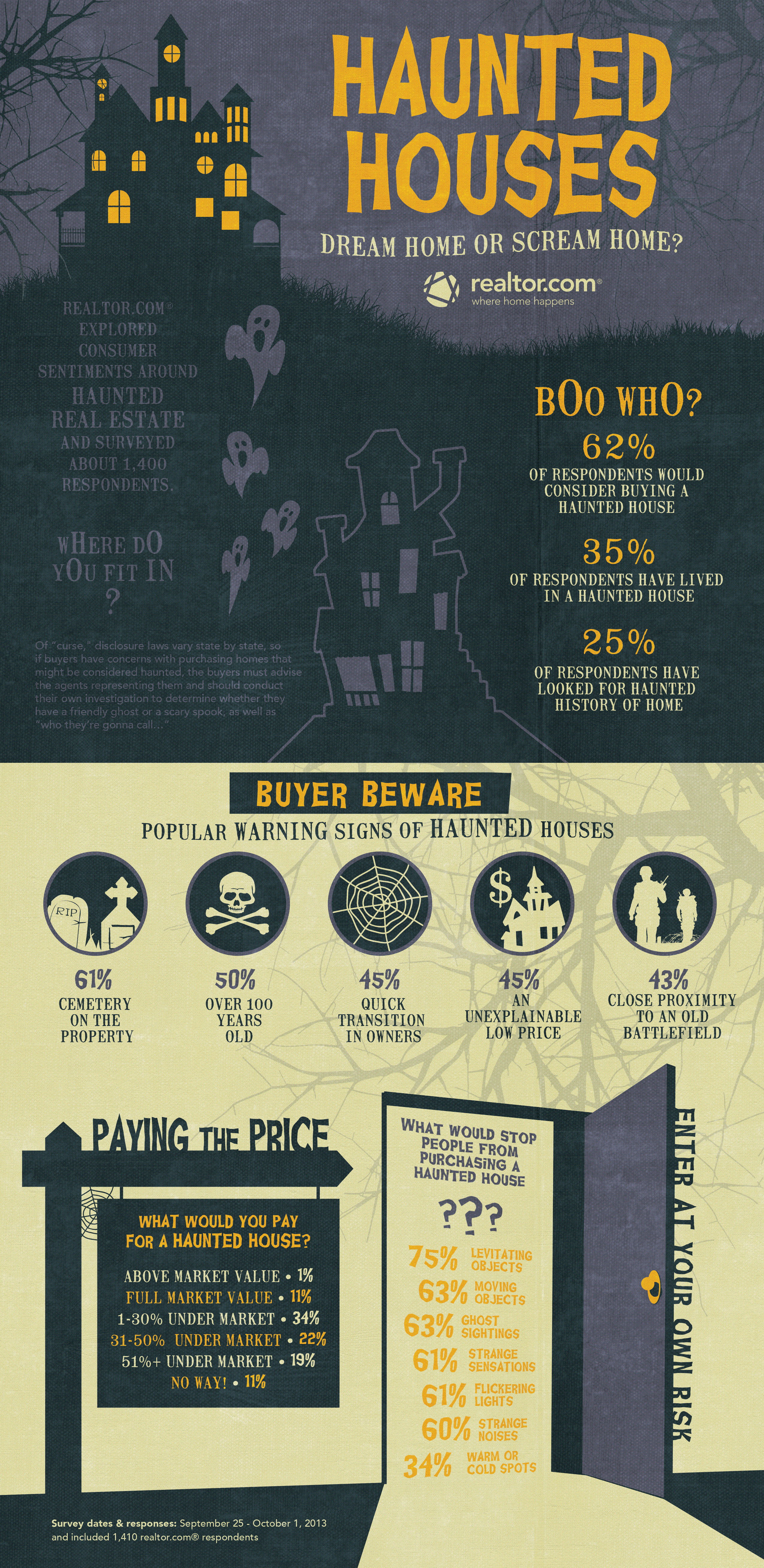
Today’s infographic from the Huffington Post and Realtor.com shows us just how many Americans would choose to buy or live in a haunted home, given the choice to do so. Out of those surveyed, 62% would consider buying a “haunted” house while 35% said that they have already lived in one. When asked what would make a house haunted, most agreed that a cemetery on the property would do the trick, although the answers ranged all the way to having an old battlefield near the home.

For more info on buying haunted homes, have a look at the graphic below. [Via]


© Grayson for Daily Infographic, 2013. |
Permalink |
No comment |

Post tags: battlefield, battlefield infographic, cemetery, cemetery infographic, ghost, ghost infographic, ghosts, ghosts infographic, graveyard, graveyard infographic, haunt, haunt infographic, haunted, haunted home, haunted home infographic, haunted house, haunted house for sale, haunted house for sale infographic, haunted house infographic, haunted houses, haunted houses infographic, haunted infographic, house is haunted, house is haunted infographic, spirit, spirit infographic, spirits, spirits infographic, what makes a haunted house, what makes a haunted house infographic

Don’t Drink and Tweet [Infographic]

Scenario: it’s another weekend night, so it’s time for you and your friends to go out and have some fun, nothing out of the ordinary. You’re having a good time hanging out, kicking back and occasionally checking your phone for time, texts, status updates or what have you; you’re probably not thinking about your past relationships at all. But then you knock one or six drinks back and suddenly that glorious machine in your hand holds some new-found power: you’re going to tell your ex just exactly what you think about them and you’ll be damned if the rest of the world doesn’t know too.

Most of us have probably been in a similar situation with phones/social media and alcohol, and man is that next morning ever terrible. Running clean-up on embarrassing social situations can be bad enough, but doing so with a hangover, knowing full well you may have just burned some bridges? No thank you.

Today’s graphic from Entrepreneur.com gives us a few examples of why you should probably put either the phone or the drink down if you’ve already had a few. Drunk dialing, while no less embarrassing, was so much simpler before the smartphone and social media. You have a few, make a bad call, then never speak to the person again (probably). With things like Facebook and Twitter, though, now you’ve got a magical megaphone to broadcast all of those sloppy emotions to everyone you know, and no one wants to see that.

For more, have a look at the graphic below. [Via]


© Grayson for Daily Infographic, 2013. |
Permalink |
One comment |

Post tags: alcohol, alcohol infographic, drink, drink infographic, drinking, drinking and facebooking, drinking and facebooking infographic, drinking and social media, drinking and social media infographic, drinking and texting, drinking and texting infographic, drinking and tweeting, drinking and tweeting infographic, drinking infographic, drunk facebook, drunk facebook infographic, drunk selfies, drunk selfies infographic, drunk social media, drunk social media infographic, drunk text, drunk text infographic, drunk texting, drunk texting infographic, drunk tweeting, drunk tweeting infographic

How Many Lines of Code Does it Take? [Infographic]

They say that coding is a language of sorts. A series of text files that ultimately are turned into 1′s and 0′s that make up a localized universe of whatever the coder intends. In this way I like to think about the programs and operating systems that we use everyday as books of sorts, and coders as the authors of these books. I know the book analogy is kind of pushing a bit far from the source, but for me it’s a way to mentally picture how much typing, thought, and information goes into the operating systems of the technology of today.

I’m not a coder myself (so please correct me if I butcher this) but basically a line of code constitutes some sort of variable to be analyzed by a computer calculator. There can also be lines of logistical preferences – action words that give input as to what to do with these variables. Also there can be lines in which to comment on these previous iterations of code – this serves to help the coder remember what the heck all of these lines of code mean. Although I’m not sure if the statistics of this infographic pertain to comment code (most likely not), it is quite astounding just how many lines of code it takes to make some of these technological operations work. Facebook for instance has at least 15 times more code in it than a Large Haydron Collider does (pre debugging). I don’t know about you, but that is kind of frightening and amazing at the same time.

[via]


© Eric Lyday for Daily Infographic, 2013. |
Permalink |
22 comments |

Post tags: code, computers, facebook, large haydron collider, lines, operating systems, technology

Last Meals [infographic]

If asked to choose what my last meal on earth would be, the answer is simple: macaroni and cheese. However, the likelihood consciously eating a meal knowing all the while that it is my last is highly unlikely, and I hope it remains that way. There are very few circumstances where I would have the opportunity to choose something like that, and the ones that are currently coming to mind involve me committing a despicable crime.

This particular infographic presents last meals in a different way. It shows us what is believed to be the last meal of some of the most iconic laid-to-rest figures sorted by caloric content on a scale of simple to fancy. Weird, right? I like it.

For example, the most fancy and caloric of them all was Titanic Captain Edward Smith, eating oysters a la Russe (part of a 12-course meal). Somewhere in the middle we have Hemingway with a New York Strip, baked potato, and a caesar salad. One of my favorites has to be Frank Sinatra with a grilled cheese sandwich. More than anything, this infographic has got me realizing just how famous these people were to have a graphic designed according to the last thing they ate before heading six feet under. [via]


© Lindsey Lawrence for Daily Infographic, 2013. |
Permalink |
No comment |

Post tags: dead, death, dinner, famous last meals, famous people, food, last meal, last meals, lunch, meal, meals

1 2 3 4