When Sea Levels Attack! [Infographic]

This infographic actually reminds me of when I was a kid watching one of my favorite movies – Water World. Freaking aqua-man Kevin Costner vs. Eye-patch Dennis Hopper. I mean, it’s really a bad movie, but it’s the concept that was so interesting to me. Of course, it was fantasy back then, but now I feel like Water World is even more convincing to me now than when I was an impressionable child who thought that Flubber was totally real.

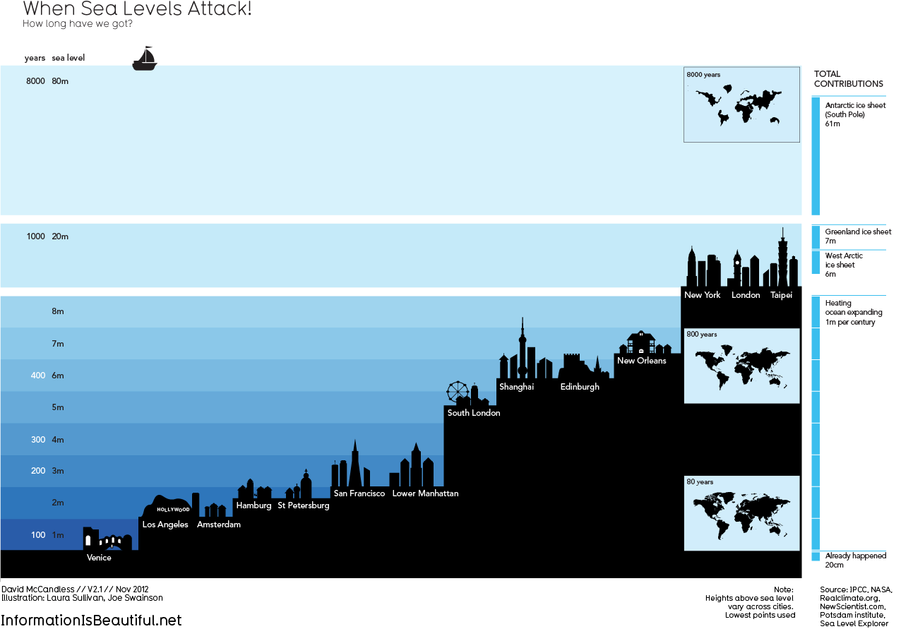
Haters gonna hate, but climate change is happening whether you like it (believe it) or not. The world is already 71% water–it doesn’t seem too outrageous to believe that melting ice might up the anty on that number majorly. Please, just watch Chasing Ice, it more than clearly shows the astonishing amount of ice that has been (and will be) falling into the sea everyday.

I’m quite sad that climate change has become such a political issue. So many scientists have proven time and time again that what we are doing on this planet affects the planet itself. It just astounds me that we haven’t been doing more to curb our carbon emissions. Well, I guess we can just live in Water World. That’d actually be pretty sweet. Nevermind. Carry on. I’ll pay you one million pounds of dirt to say you never read this infographic. (I want to be Kevin Costner)

[via]


© Eric Lyday for Daily Infographic, 2013. |
Permalink |
One comment |

Post tags: calving, Chasing Ice, climate change, earth, global warming, ice, levels, ocean, planet, Polar, salt water, sea, sheets, water, Water World

South Carolina [infographic]

I’m writing this post from South Carolina, where I have spent the past week for a cousin’s wedding. Normally I’d be pretty cranky since I’ve spent the past week in a crowded house with over 10 loud and crazy relatives, but because South Carolina is pretty much the best place I’ve ever visited, I don’t mind at all!

The weather has been absolutely amazing, like mid 70′s all day. This is heaven since I’m currently living in South Texas, where the humidity usually overpowers any cold front that might pass by (seriously it was 88 degrees last Christmas). I’m sold on the beautiful weather and lush foliage here in South Carolina and I fully intend on making my way back up here for either graduate school, or a job. With that said, I figured I’d post some South Carolina facts so I can be a good citizen in the future. Today’s infographic gives us some historical facts about this wonderful state. Hopefully you South Carolinians will enjoy it! [via]


© Jasmin for Daily Infographic, 2013. |
Permalink |
2 comments |

Post tags: bible belt, citizen, cool, East Coast, facts, history, knowledge, peaches, South Carolina, southern hospitality, trivia, Weather

Infographics are visually compelling

Infographics are visually compelling, therefore will attract many users that could potentially generate link-through leads. It is an excellent way to include mass data into single graphic and an efficient way of combining the best of text, images and design to represent complex data that tells a story that begs to be shared through social networks.

Data overload infographics are unique because they will often combine different types of infographics into one massive piece of information. For example, a data overload infographic could contain flowchart elements, while also incorporating typography, graphs, charts, and elaborate illustrations. Typically data overload charts are there to expound on a certain subject in order to raise awareness. Their purpose should be more informative than persuasive, since subjective data is relatively useless.

While this list may not be exhaustive, you may still benefit from understanding the sheer spectrum of infographics and what they can accomplish. It doesn’t matter if your information is simple or complex, you can convey it in an infographic in a form that will be easier for your audience to understand.

People today have less time hence they do not spend huge time browsing any site. The present web customers are seen hardly spending for 10 seconds or less over any site, hence using the infographics can really boost up the chance of getting the attention of people in no time along with imparting the message in quickest promising time duration.

Publishing fresh content on your website means less if no one is sharing into their social networks and nothing if there are no readers in the first place. In online marketing the key goal is to generate leads, and these leads are usually generated from search results. Infographics existed long before but became a strong tool for marketers. It is a tool that is easy to understand and provides higher potential for content going viral.

When you create an infographic with your logo embedded and brand displayed it will turn increase Brand Awareness. The more viral nature of the infographic medium makes people link to your site therefore benefitting SEO (Search Engine Optimization), and they are also capable of sharing knowledge with viewers so that your company is an expert on your category or topic.Publishing fresh content on your website means less if no one is sharing into their social networks and nothing if there are no readers in the first place. In online marketing the key goal is to generate leads, and these leads are usually generated from search results. Infographics existed long before but became a strong tool for marketers. It is a tool that is easy to understand and provides higher potential for content going viral.

The Life And Times Of Bill Murray [infographic]

Oh, Bill Murray. What’s not to love about this man?

I don’t think any other actor has ever brought charm and charisma to the big screen quite like Bill Murray. Lost in Translation has always been my go-to movie when I’m feeling melancholy and a little lost. And everything he ever did for Wes Anderson has been beyond brilliant. The man has been in 64 films in over 5 decades and continues to win audiences over to this day. Apparently, he even made it out to my hometown during SXSW in 2010, and found himself at a local bar serving people tequila shots, no matter what they asked for. Bill, could you be any more awesome?

The whole “Bill Murray Party Crashing Tour” may have been a hoax, but there may be some truth in the tale of old Bill sneaking up behind people, covering their eyes, saying, “Guess who,” waiting for them to turn around, and replying “No one will ever believe you.” (At least we can hope it’s true!)

And now for some great lines from a Lost in Translation scene:

Charlotte: I just don’t know what I’m supposed to be.
Bob: You’ll figure that out. The more you know who you are, and what you want, the less you let things upset you.

[Via]

8pCu53c


© Micaela Lacy for Daily Infographic, 2013. |
Permalink |
One comment |

Post tags: actor, Bill Murray, Bill Murray Party Crashing Tour, Comedian, Entertainment, film, Groundhog Day, Lost in Translation, Star, Wes Anderson

A Timeline of Schoolyard Sensations [infographic]

It wasn’t really acing my spelling test or getting a check plus on my homework assignment–though that’s what was relayed to my parents–that made a day in elementary school so great. It wasn’t even the gold star on my star chart or getting chosen for after school safety patrol that made me bounce giddily at the dinner table. The real glamor of elementary school life takes place on the playground. You could guarantee a happy little camper as long as recess included the following: (1) a well fed Tamagochi, (2) my sparkly spider Pog slammer dominating in a game of Pogs, and (3) being chased by my crush until one of us falls and skins our knee.

I hadn’t thought of those simple times in many moons, not until I read this infographic on the history of schoolyard sensations. It’s a serious blast from the past. I know far too many on this list (Chicago Bulls TY Beanie Baby anyone?). Thankfully, I have no idea what Beyblades are. I don’t want to know what Beyblades are.  What would you say the present day schoolyard sensation is? The iPhone 5s? [via]


© Lindsey Lawrence for Daily Infographic, 2013. |
Permalink |
One comment |

Post tags: Playground, Pogs, Recess, rubix cube, Schoolyard, slinky, toys, Trolls, TY Beanie Baby, Yoyo

Brain Boosters and Brain Busters [infographic]

“Hey I’m getting Chinese, do you want anything?”

Normally I would say “Heck yeah! Get me some of that General Tso chicken!”

Eating junky food is so easy. Not to mention it tastes awesome. So often it is much easier for time’s sake to get something unhealthy than it is to get something healthy. Many believe that as long as you look fit and healthy it means that you actually are. But that is a farce. What good is looking fit if your brain isn’t getting the proper nutrients?

Eating right can be easy! All you need is to be informed. The following infograph will show you simple foods you can eat to keep your mind bright and functioning and how you can even avoid the illnesses that can often come with age.

Stay away from the salty foods! Not only are they bad for your brain, they’re bad for your heart. Stop with the fast food. If it helps, carry a backpack with healthy snacks. Plan ahead! Eating healthy doesn’t need to be expensive. Stores have deals on fish and fruits all the time. Even nuts sometimes.

The important thing is that you are aware of how the food you consume will affect you in the long run. If looking fit turns people on, shouldn’t a brain with a healthy dose of all the essentials be sexy too? [via]

brain-boosters-and-brain-busters_523ac6280e90f


© J.P. Blackard for Daily Infographic, 2013. |
Permalink |
2 comments |

Post tags: Brain, Diet, food, functioning, Healthy, illness, nutrients, plan, sexy, unhealthy

Last Meals [infographic]

If asked to choose what my last meal on earth would be, the answer is simple: macaroni and cheese. However, the likelihood consciously eating a meal knowing all the while that it is my last is highly unlikely, and I hope it remains that way. There are very few circumstances where I would have the opportunity to choose something like that, and the ones that are currently coming to mind involve me committing a despicable crime.

This particular infographic presents last meals in a different way. It shows us what is believed to be the last meal of some of the most iconic laid-to-rest figures sorted by caloric content on a scale of simple to fancy. Weird, right? I like it.

For example, the most fancy and caloric of them all was Titanic Captain Edward Smith, eating oysters a la Russe (part of a 12-course meal). Somewhere in the middle we have Hemingway with a New York Strip, baked potato, and a caesar salad. One of my favorites has to be Frank Sinatra with a grilled cheese sandwich. More than anything, this infographic has got me realizing just how famous these people were to have a graphic designed according to the last thing they ate before heading six feet under. [via]


© Lindsey Lawrence for Daily Infographic, 2013. |
Permalink |
No comment |

Post tags: dead, death, dinner, famous last meals, famous people, food, last meal, last meals, lunch, meal, meals

1 38 39 40