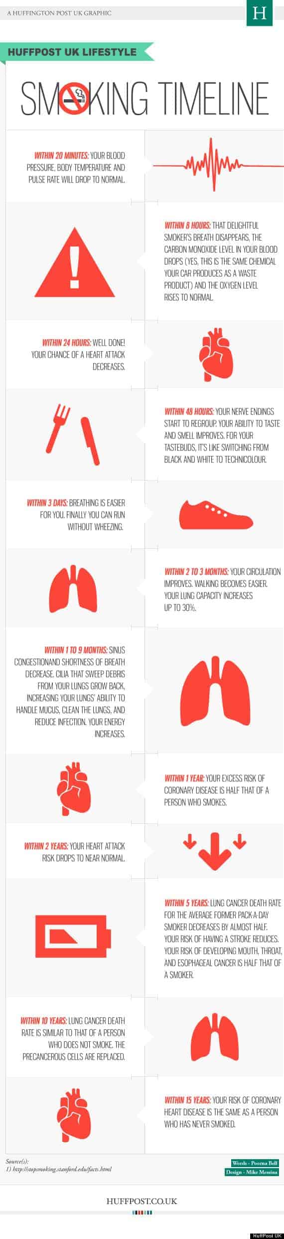
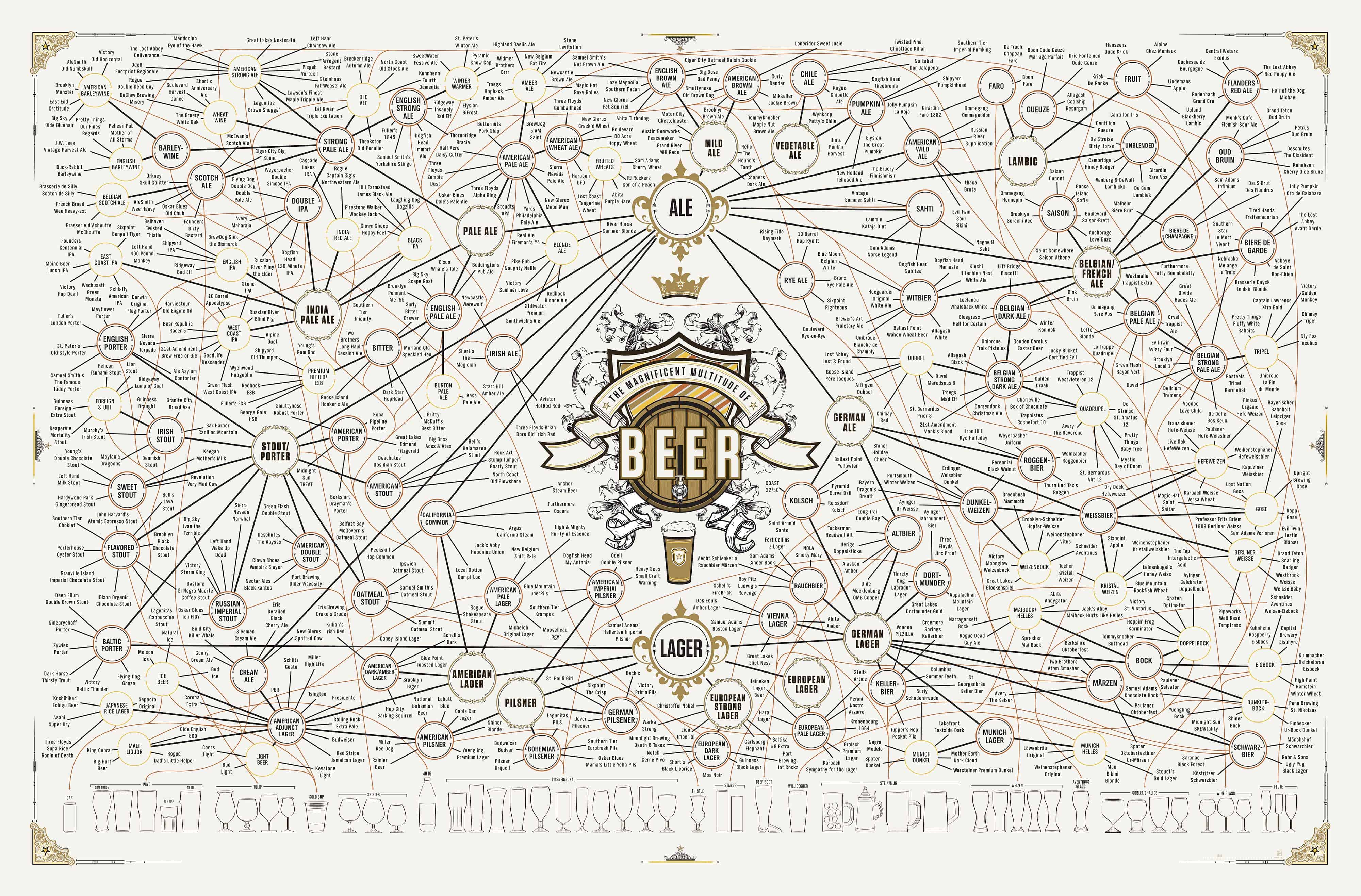
Which States Love Dogs the Most? [Infographic]

Dogs are one of America’s top pets; they are man’s best friend, after all. America has a huge amount of dog owners, with one in three households being home to a furry friend, and two thirds of that number consider their dog a family member. Which states in the U.S. tend to own more dogs than others, though? On the other hand, which states have the fewest percentage of dog owners?

Today’s infographic from the Huffington Post gives us a look at some statistics for dog ownership across America. Most people getting a new dog are going to do so at a shelter, which is usually always good for the dog and shelter alike. Thankfully, very few people obtain their dog as a gift, since giving a pet as a gift can often be a bad idea.

For more info on dog ownership in America have a look at the graphic below. [Via]


© Grayson for Daily Infographic, 2013. |
Permalink |
One comment |

Post tags: Dog, dog infographic, dog ownership, dog ownership in America, dog ownership in America infographic, dog ownership infographic, dog size popularity, dog size popularity infographic, dogs, dogs in America, dogs in America infographic, dogs infographic, most popular American dog breeds, most popular American dog breeds infographic, most popular dog breeds, most popular dog breeds infographic, most popular dog names, most popular dog names infographic, most popular female dog names, most popular female dog names infographic, most popular male dog names, most popular male dog names infographic, top states for dog ownership, top states for dog ownership infographic

Incandescent Vs LED Christmas Lights [infographic]

As Halloween quickly approaches, it’s time to start thinking about the holiday that matters the most year round. Christmas, is without a doubt, a time that brings families and communities together in celebration, and even competition. We all love to get involved with traditions and festivities that go along with “the most wonderful time of the year.”

Christmas lights bring back so many memories for so many people that the tradition of hanging lights is a fun, yet thoroughly arduous activity. After all the hard work is done, there definitely comes a sense of thankfulness. Once you have your lights up, you can be thankful that you have a roof over head, you can be thankful that your lights will more often than not make others happy, as well as make you feel that you are a part of something bigger than yourself.

Although Christmas lights bring happy feelings and look great, Christmas lights can be expensive. According to this infographic, people can be spending way more than they have to on their electric bill. Although LED lights are more expensive than incandescents, the cost of running them is far below the cost to run incandescents.

Though not traditional, LEDs run with lower wattage, longer life-spans, you can connect more strings, and you never have to replace bulbs. By saving on electricity (money), you have more money to spend on those you care for and more time to enjoy it with them. [via]

incandescent-vs-led-christmas-lights_526b06dc93d33


© J.P. Blackard for Daily Infographic, 2013. |
Permalink |
One comment |

Post tags: celebration, christmas, family, happy, led, lights, money, thankfulness, Time, tradition

10 Most Visited Cities in the World [infographic]

I have the travel bug. It’s been a year and a half since I have been abroad, and it is starting to get to me. This may seem like a short amount of time to you, but it feels like eternity to me. Traveling is like getting tattoos (or so I am told because I don’t actually have any tattoos), once you go on one trip, you’re going to want to go on a million trips. Here’s a better analogy: traveling is like the book If You Give a Mouse a Cookie. Once you’ve seen one place, you are going to want to see all the places. And if you are going to see all the places, you best get a move on. If you’re not sure exactly where to start, check out the infographic below. It lists the top ten most visited cities in the world.

It can seem impossible to make it abroad, but I can assure you it’s not–especially for college students and recent grads. Yesterday I submitted a graduate application to a school in Barcelona. And I have numerous friends that have studied or worked abroad. I have a friend right now that is in Africa on a Fulbright scholarship and another two friends that just submitted their Fulbright application to teach English in Brazil. There are tons of options out there. If you want to travel, you will make it happen. [via]


© Lindsey Lawrence for Daily Infographic, 2013. |
Permalink |
One comment |

Post tags: 10 most visited cities, Bangkok, Global Destination, London, new york, paris, study abroad, travel, travel abroad

The Marshmallow’s Rise to Fame [infographic]

Halloween 2009, my mother worked hard for no particular reason (other than that she is awesome) to make popcorn balls for my theater class. I was a senior that year, and very popular among the thespians. When I showed up to class with popcorn balls, everyone dug in, even the vegans. As you may know, popcorn balls are often held together by marshmallow fluff, and marshmallow fluff is often NOT vegan friendly. It wasn’t 5 minutes later that I had a bawling vegan on my hands. She blamed me for causing her to eat an animal’s flesh in the form of marshmallow fluff. I wouldn’t be annoyed if this was a legitimate I-know-about-things-and-care-about-animals vegan, but this was a I-held-a-door-open-for-a-girl-once-and-she-said-thank-you-now-she-is-my best-friend-and-she-is-vegan-so-I-am-a-vegan-too kind of girl, no judgment. After the bawl fest the girl continued to receive comfort from others with “the animal was already dead, don’t think about it, it was already dead.” But guess what audience! Turns out that the popcorn balls were made out of peanut butter, not marshmallow! So she didn’t break her door-opening covenant!

Marshmallows are gross unless they are toasted.
[via]


© Lena Long for Daily Infographic, 2013. |
Permalink |
No comment |

Post tags: candy, fire, flush, marshmallow, roasted, S’mores, soft, sugar, toasted, vegan, white

Don’t Drink and Tweet [Infographic]

Scenario: it’s another weekend night, so it’s time for you and your friends to go out and have some fun, nothing out of the ordinary. You’re having a good time hanging out, kicking back and occasionally checking your phone for time, texts, status updates or what have you; you’re probably not thinking about your past relationships at all. But then you knock one or six drinks back and suddenly that glorious machine in your hand holds some new-found power: you’re going to tell your ex just exactly what you think about them and you’ll be damned if the rest of the world doesn’t know too.

Most of us have probably been in a similar situation with phones/social media and alcohol, and man is that next morning ever terrible. Running clean-up on embarrassing social situations can be bad enough, but doing so with a hangover, knowing full well you may have just burned some bridges? No thank you.

Today’s graphic from Entrepreneur.com gives us a few examples of why you should probably put either the phone or the drink down if you’ve already had a few. Drunk dialing, while no less embarrassing, was so much simpler before the smartphone and social media. You have a few, make a bad call, then never speak to the person again (probably). With things like Facebook and Twitter, though, now you’ve got a magical megaphone to broadcast all of those sloppy emotions to everyone you know, and no one wants to see that.

For more, have a look at the graphic below. [Via]


© Grayson for Daily Infographic, 2013. |
Permalink |
One comment |

Post tags: alcohol, alcohol infographic, drink, drink infographic, drinking, drinking and facebooking, drinking and facebooking infographic, drinking and social media, drinking and social media infographic, drinking and texting, drinking and texting infographic, drinking and tweeting, drinking and tweeting infographic, drinking infographic, drunk facebook, drunk facebook infographic, drunk selfies, drunk selfies infographic, drunk social media, drunk social media infographic, drunk text, drunk text infographic, drunk texting, drunk texting infographic, drunk tweeting, drunk tweeting infographic

The Complete History Of Coffee [infographic]

Today’s infographic gives us a look at the history of America’s favorite pick-me-up: coffee. An estimated 1.6 billion cups of coffee are enjoyed around the world each day. This infographic shows a pleasantly structured historical timeline of the process of coffee making and some of the people involved.

Make no mistake about it, coffee is an art form to many. Some people take their coffee seriously and are constantly searching for ways to create the perfect cup. The best method I’m told is not the french press method–which I had grown quite fond of. The single-cup pour-over method is apparently the best way to go. A passionate coffee maker, barista, and local business owner recently enlightened me with this information, and also shared the secret of presoaking coffee grounds to achieve a “blooming effect.” If you pour hot water over your coffee grounds and let them soak for 30-45 seconds apparently gases are able to escape and the coffee is able to “bloom,” which results in a better tasting beverage.

I think it’s also worth noting that 54% of coffee drinkers say that coffee makes them feel more like themselves. But maybe they just like their caffeinated selves a little bit better. Either way, check out today’s infographic to learn more about your favorite cup of joe. [Via]

1infographics_coffee_final


© Micaela Lacy for Daily Infographic, 2013. |
Permalink |
No comment |

Post tags: barista, blooming, blooming effect, business of coffee, caffeine, coffee, coffee beans, coffee blooming, coffee grounds, coffee infographic, coffee shops, espresso, infographic, local coffee

How Many Lines of Code Does it Take? [Infographic]

They say that coding is a language of sorts. A series of text files that ultimately are turned into 1′s and 0′s that make up a localized universe of whatever the coder intends. In this way I like to think about the programs and operating systems that we use everyday as books of sorts, and coders as the authors of these books. I know the book analogy is kind of pushing a bit far from the source, but for me it’s a way to mentally picture how much typing, thought, and information goes into the operating systems of the technology of today.

I’m not a coder myself (so please correct me if I butcher this) but basically a line of code constitutes some sort of variable to be analyzed by a computer calculator. There can also be lines of logistical preferences – action words that give input as to what to do with these variables. Also there can be lines in which to comment on these previous iterations of code – this serves to help the coder remember what the heck all of these lines of code mean. Although I’m not sure if the statistics of this infographic pertain to comment code (most likely not), it is quite astounding just how many lines of code it takes to make some of these technological operations work. Facebook for instance has at least 15 times more code in it than a Large Haydron Collider does (pre debugging). I don’t know about you, but that is kind of frightening and amazing at the same time.

[via]


© Eric Lyday for Daily Infographic, 2013. |
Permalink |
22 comments |

Post tags: code, computers, facebook, large haydron collider, lines, operating systems, technology

1 35 36 37 38 39 40